Pavegen
Project Details
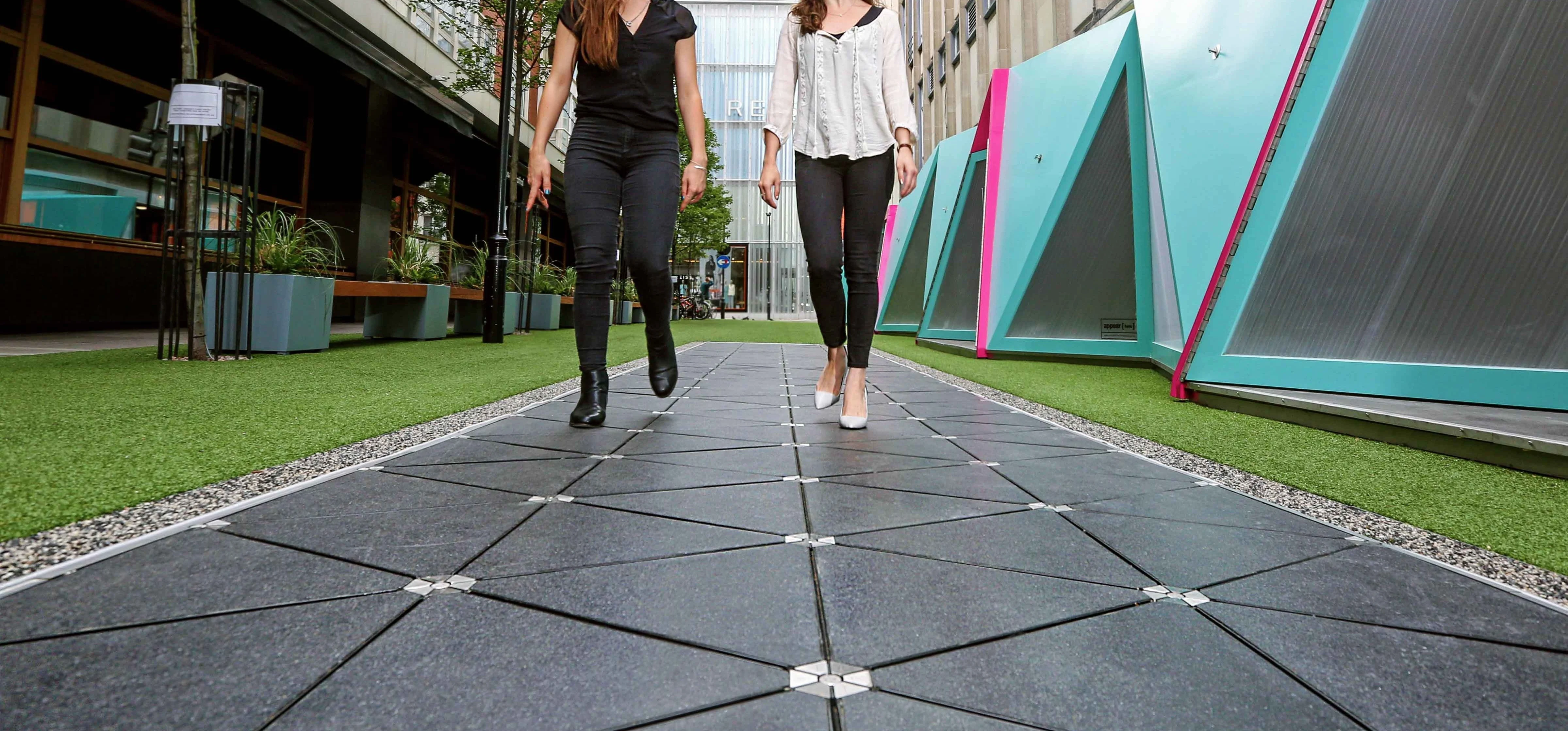
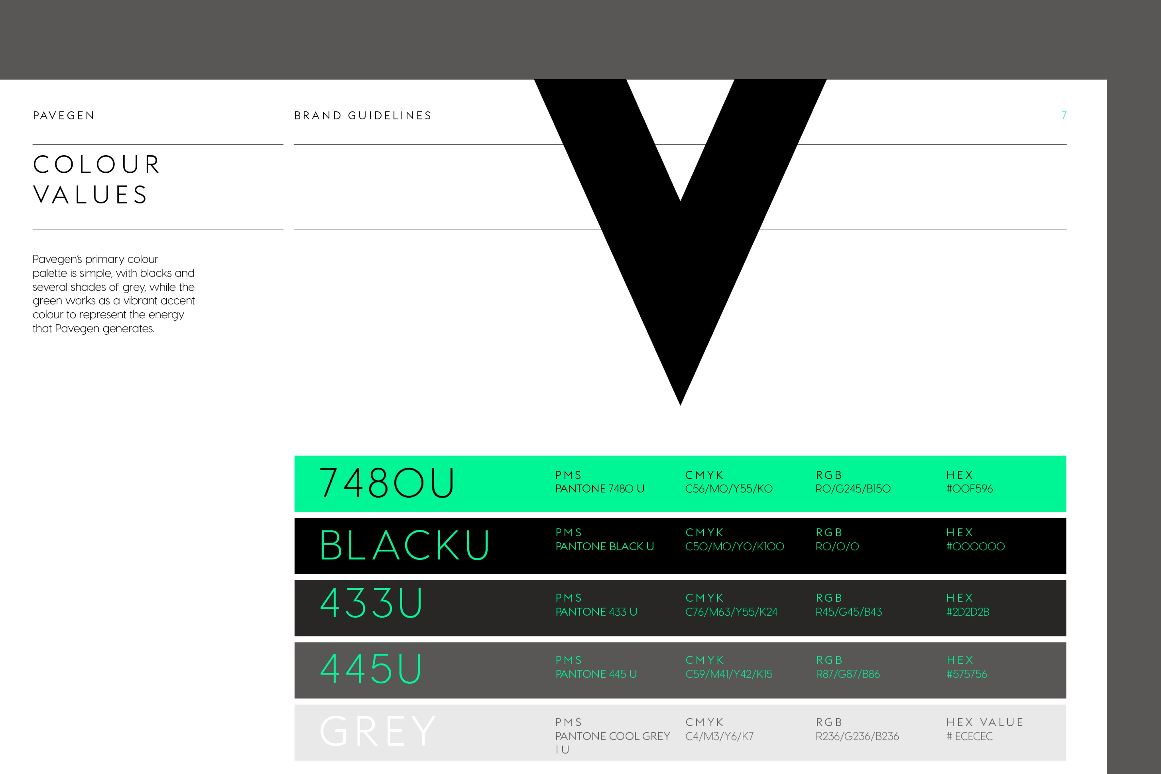
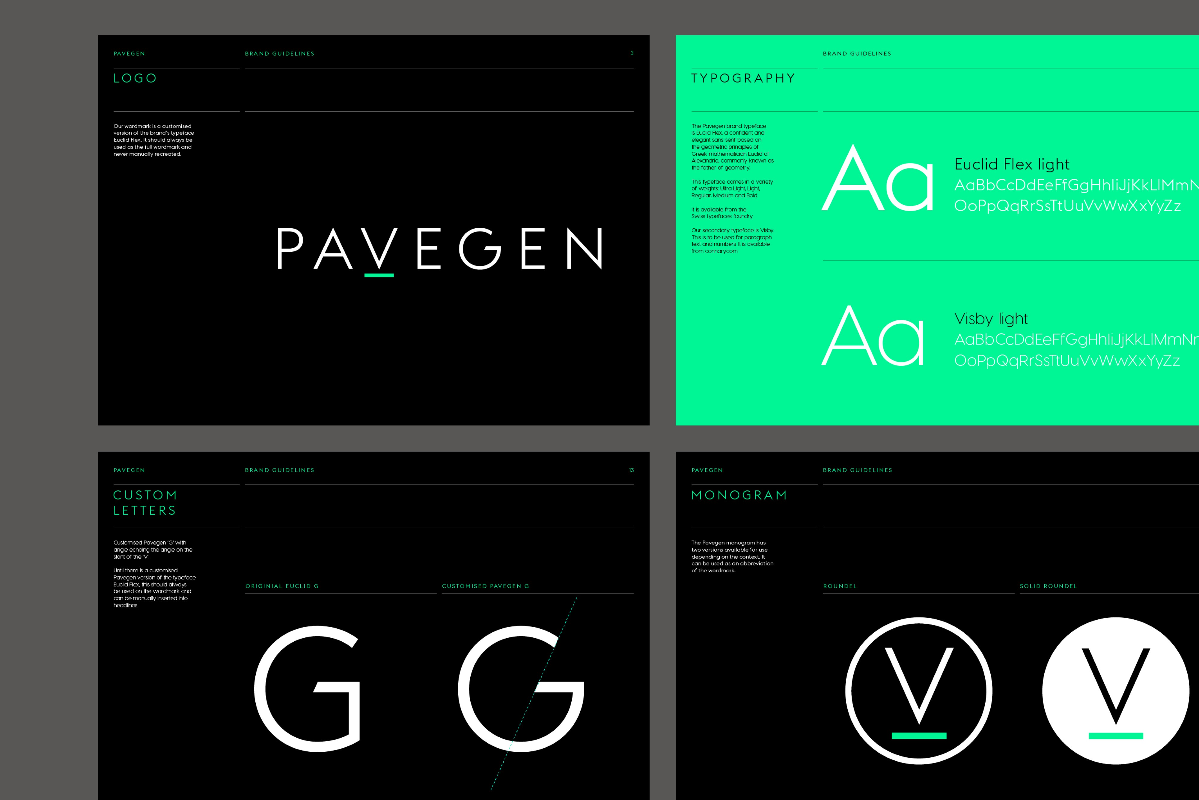
Pavegen create innovative floortiles that convert kinetic step energy into electricity. The design solution for the brand uses the ‘V’ symbolically as a downward facing arrow. This is partnered with an underline, representing a floortile, shown in a vibrant green, to illustrate an energetic charge. Worked on at Ascend Studio.
Client
Sector
Category
Year
Pavegen
Energy
Brand Identity
2017
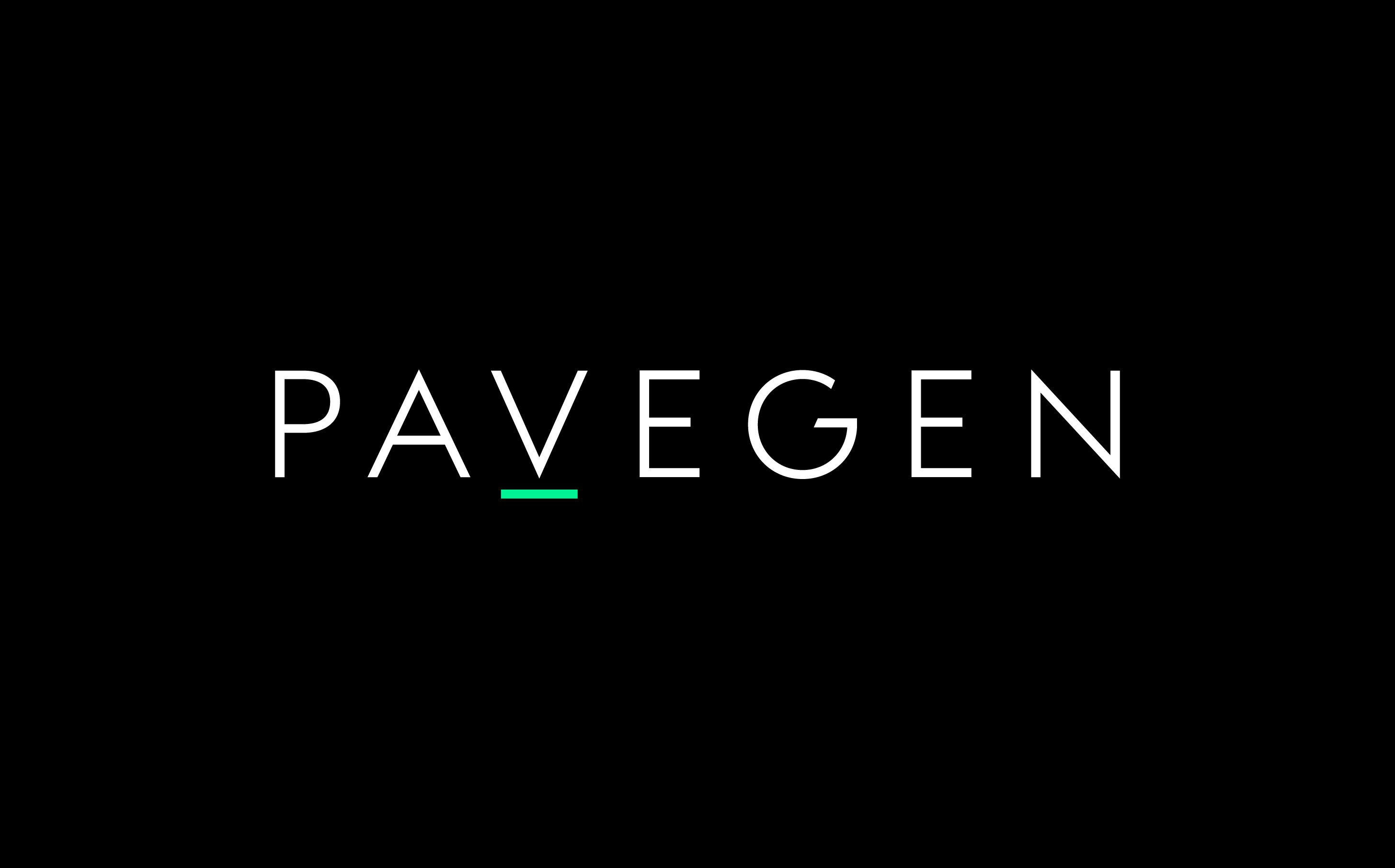
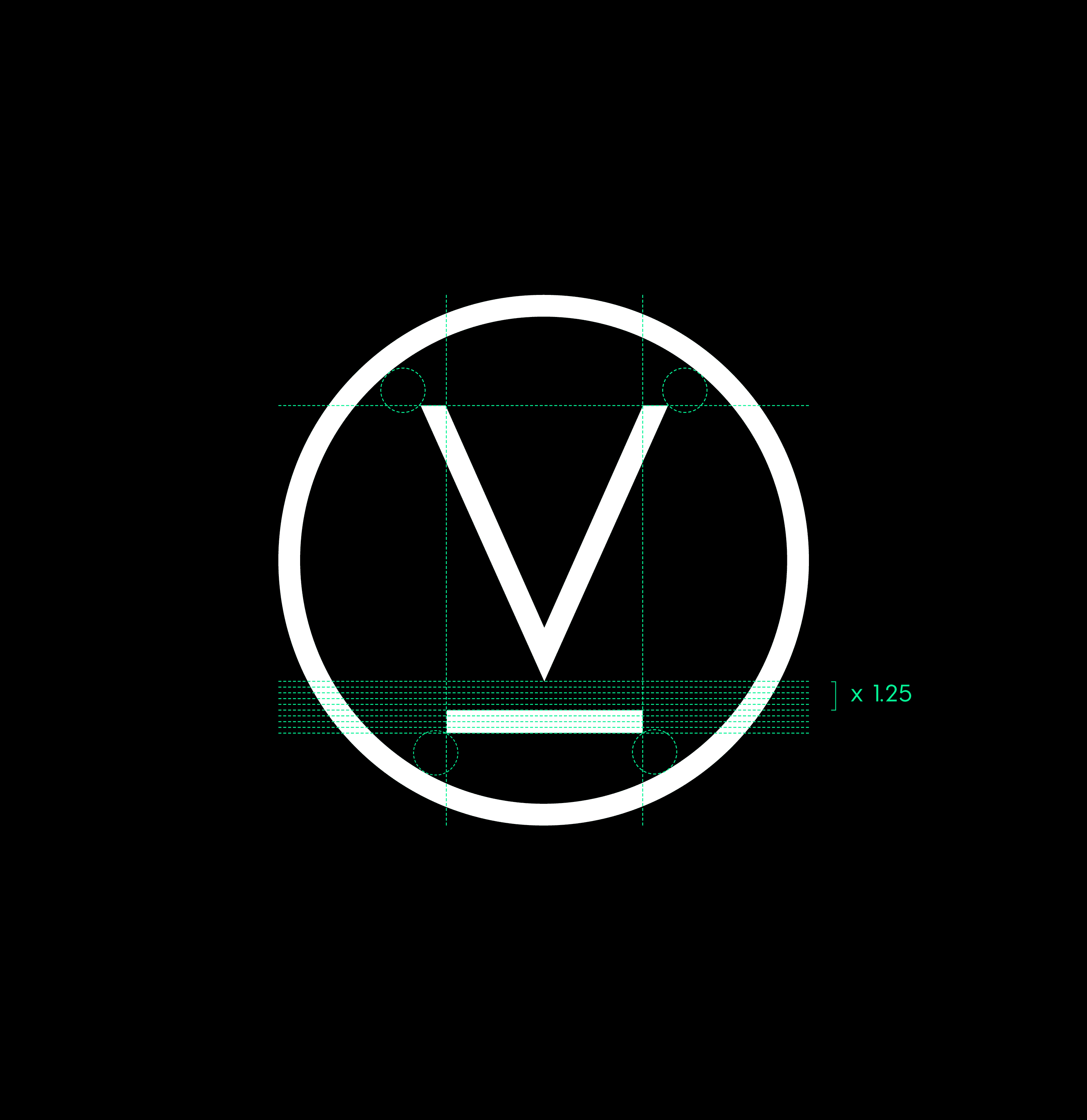
We created a simple typographic symbol that represented the core premiss of the business. Turning downward pressure into electricity.

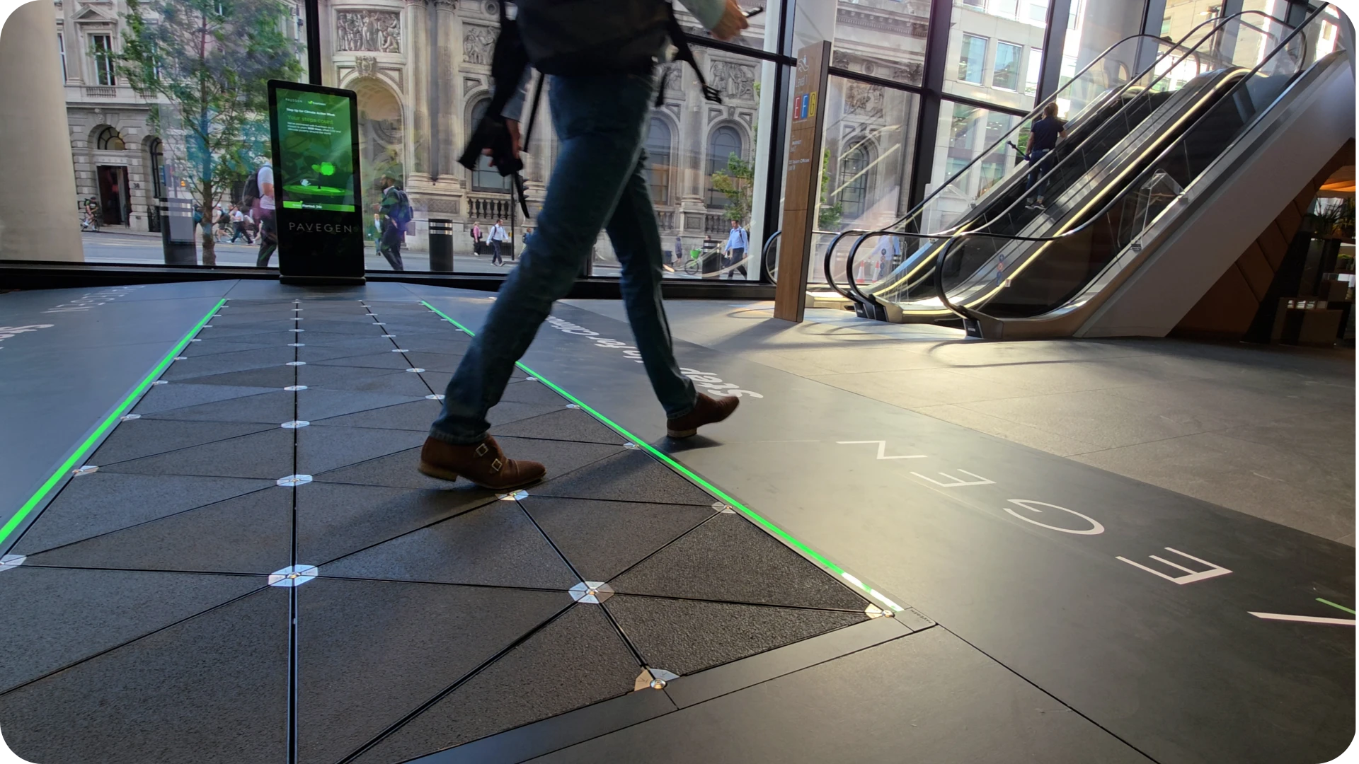
The floor-tiles center on empowering people and communities to create positive change through its kinetic energy and data technology.