Shoreride
Project Details
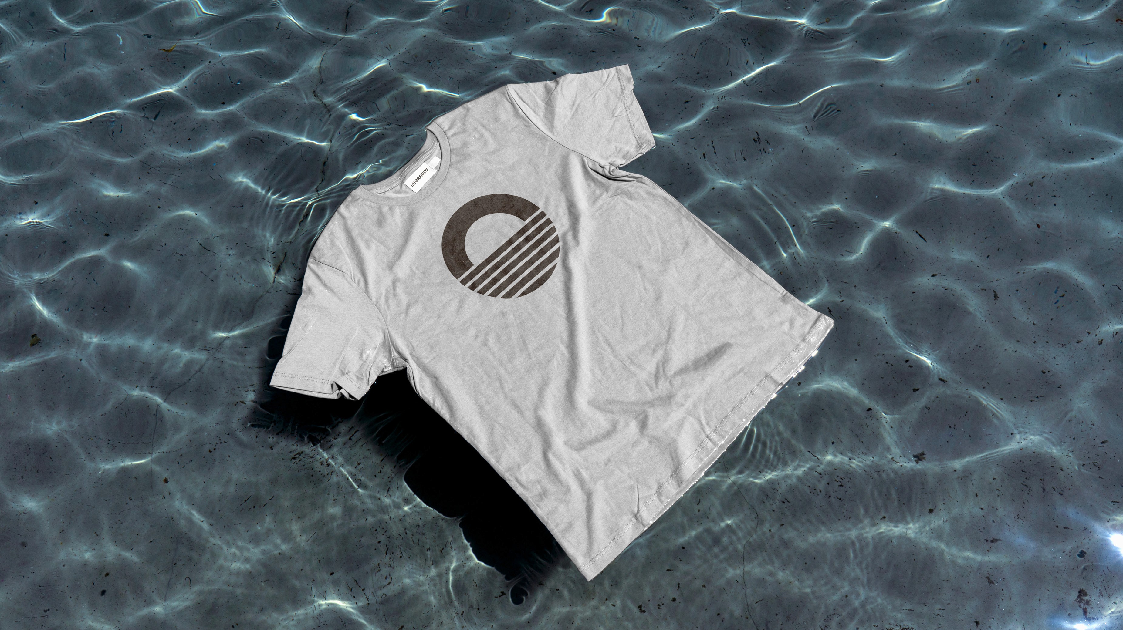
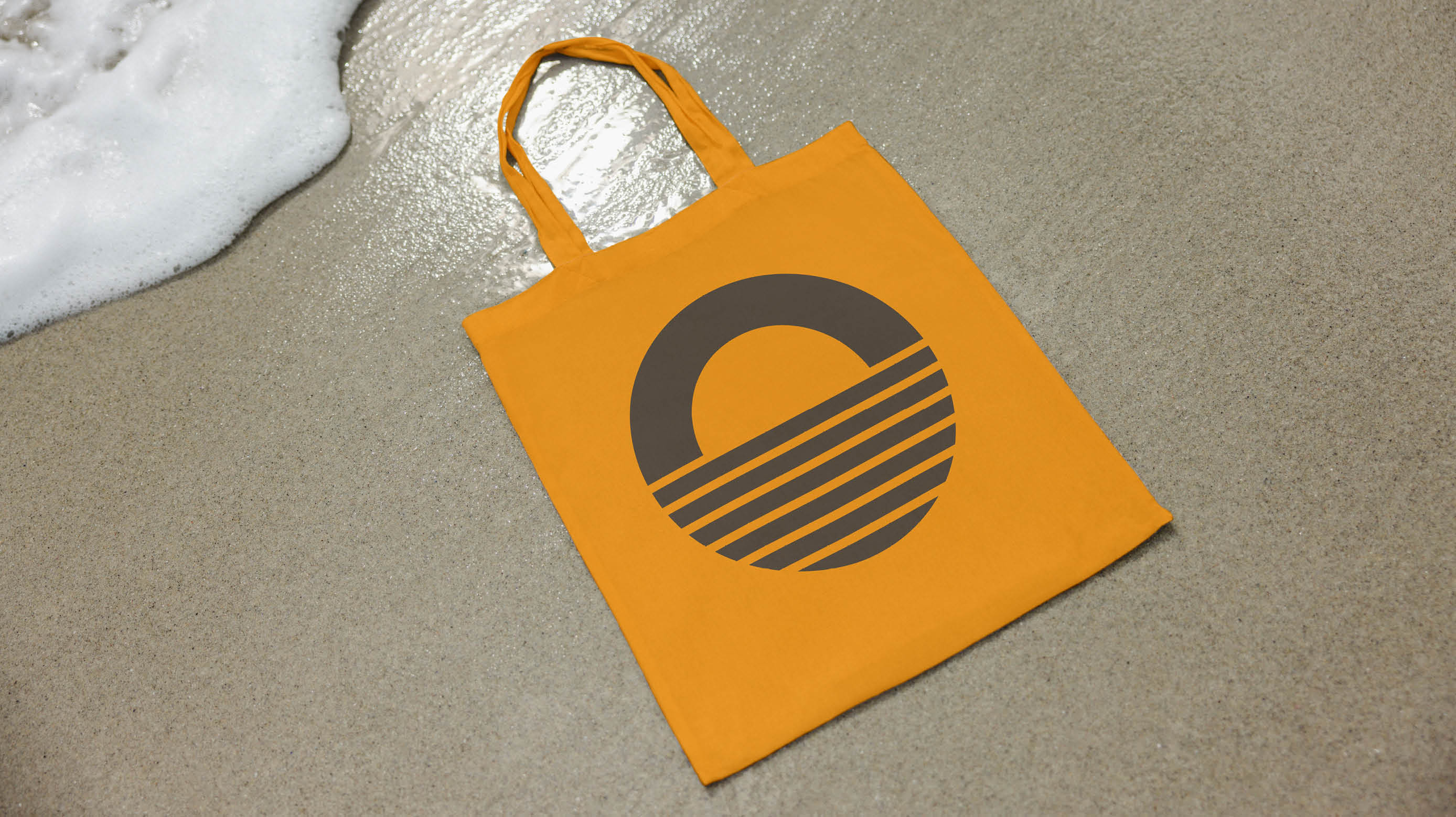
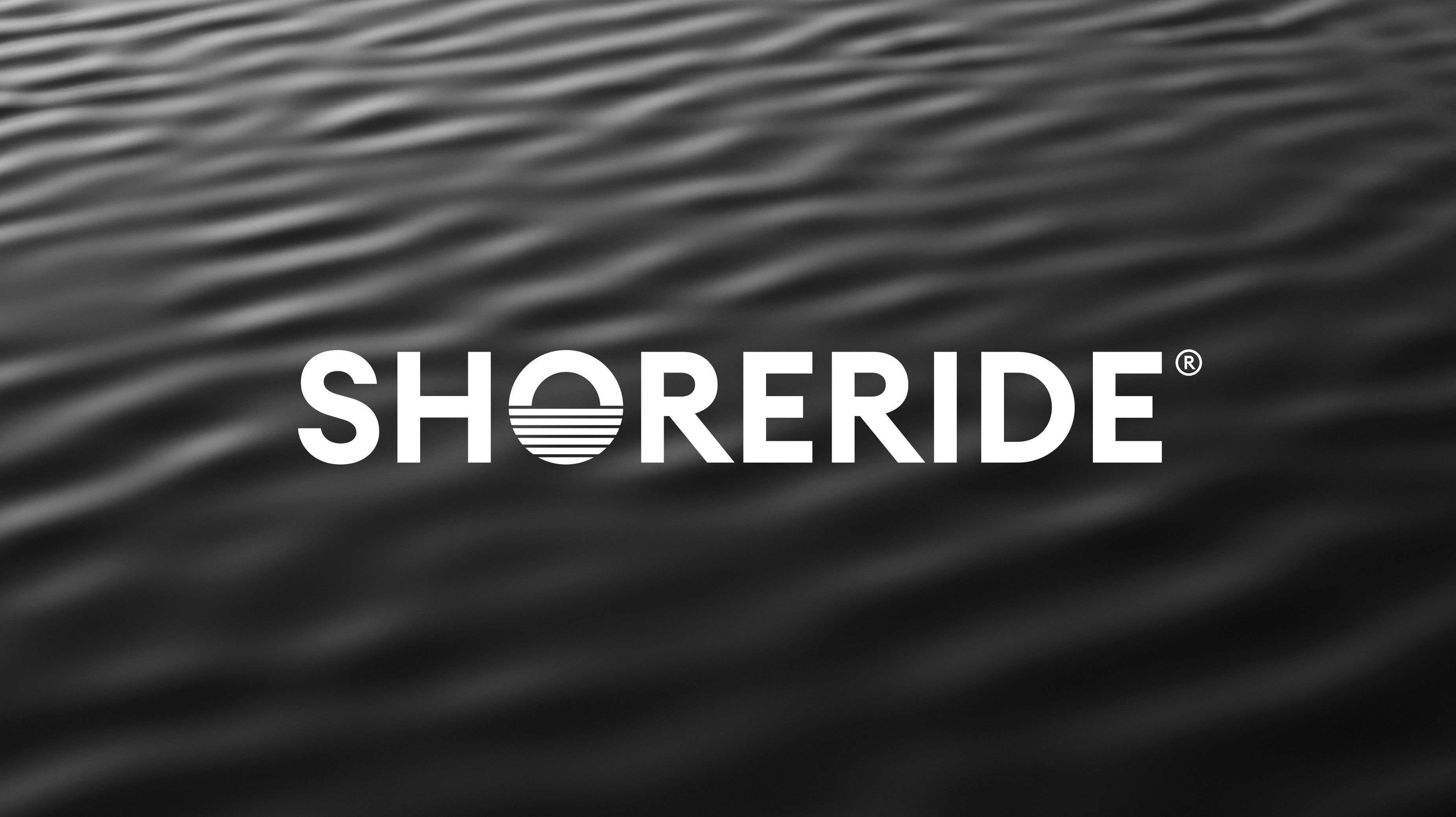
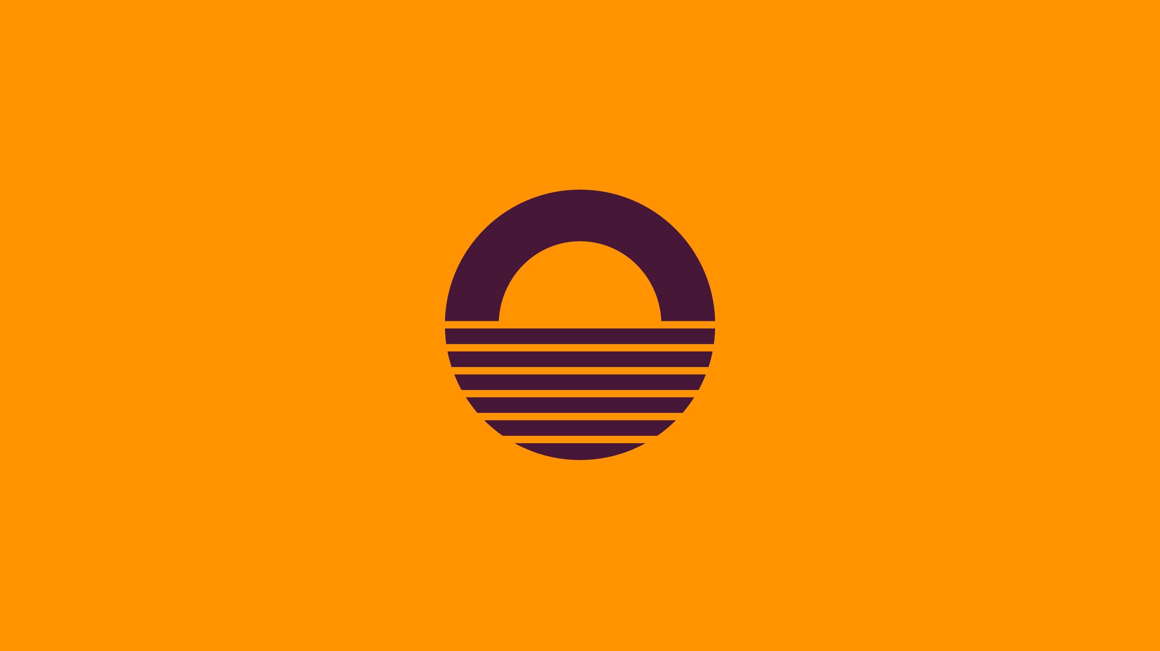
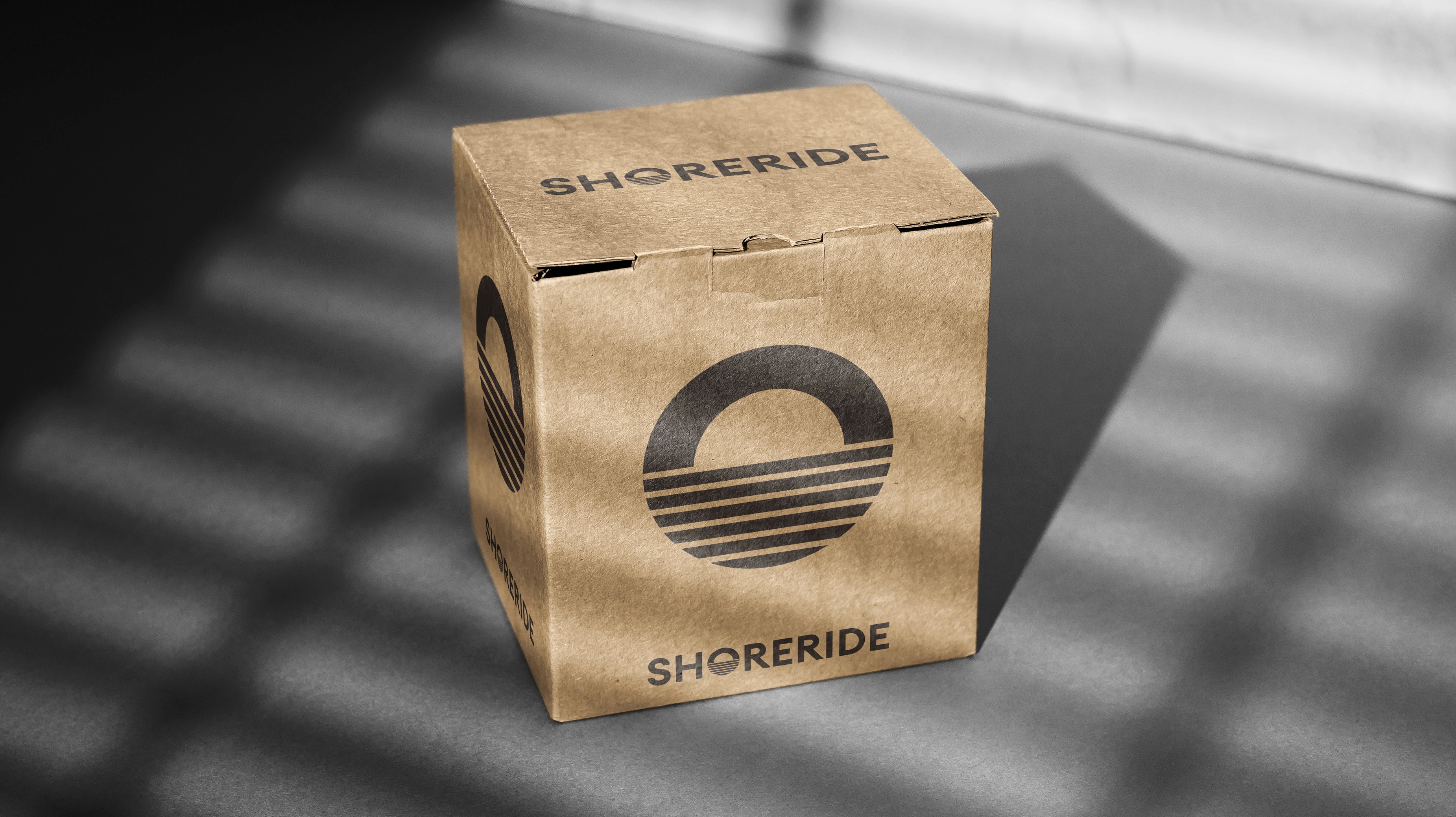
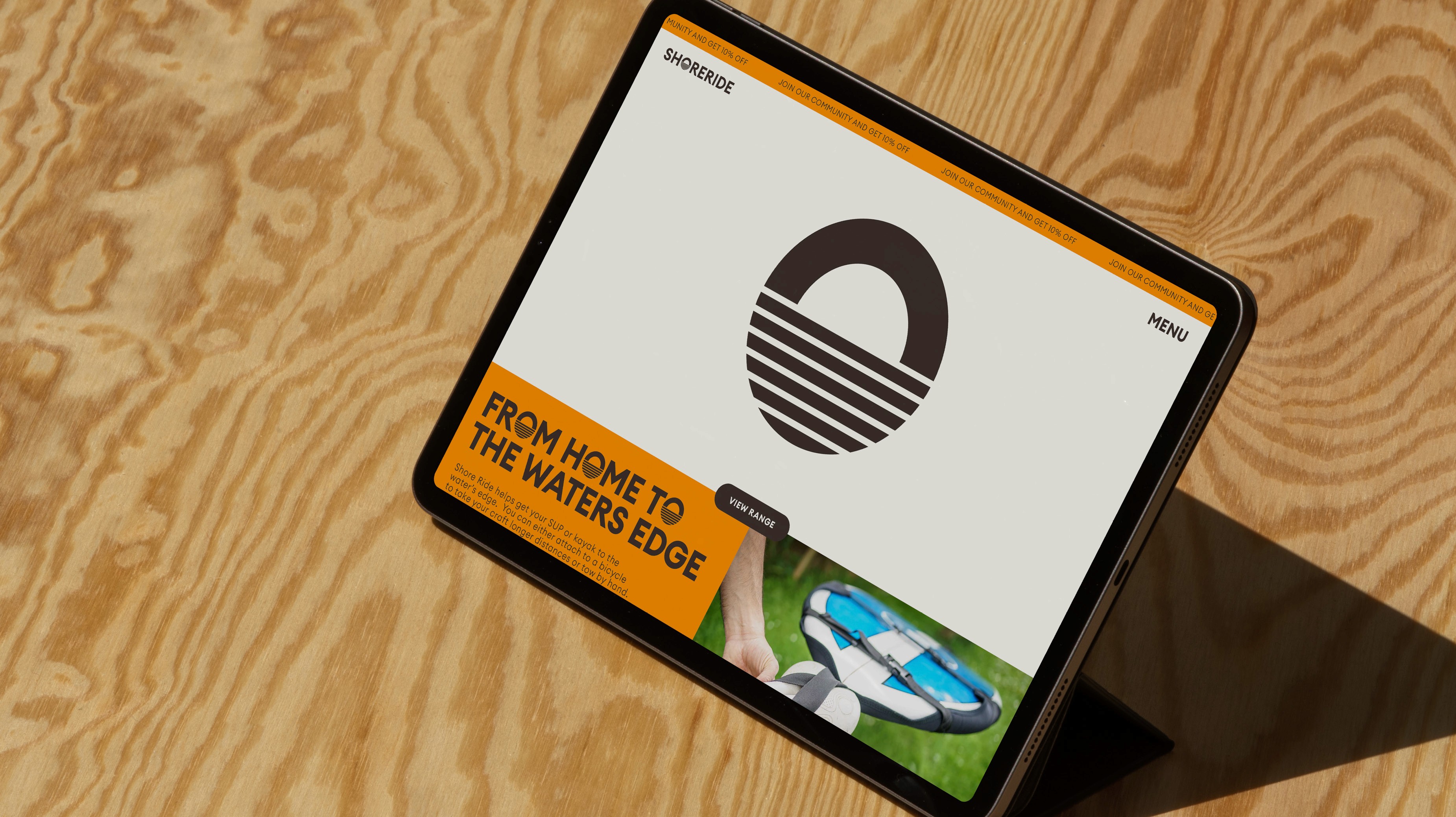
Shoreride is a product that makes it simple for people to get their paddleboard or kayak to the water. For people that live close to the water and want to get there in a hassle-free way, without using their car. The product is a compact, easy to use device, on wheels, that attaches to the back of a bike. The symbol was inspired by the calmness and contentment that comes from spending time in the water. Through early conversations with the founder it was clear that this was more than a paddleboard/kayak product. It was about the spiritual aspect of being more connected to the ocean, rivers or lakes and the mental health benefits of having regular water based activities. It seemed clear from this that the design needed to have a sense of calmness and tranquility to it, hence the sunrise on still water symbol. The colour palette is deliberately vibrant and energetic as this will need to exist in the outdoor and water sports sector alongside paddleboard and kayak brands. The symbol can be used as a standalone device or to replace the ‘O’ within headline statements.
Client
Sector
Category
Year
Shoreride
Outdoor sports
Brand Identity
2023

The design solution was more than just representing the product. It was about representing the calmness and serenity that comes from time spent in the sea.

"Arthur made things look good but he also went deep into the project, exploring different ideas and concepts to try and create something unique."