
Forest IQ
Brand Identity & Data Platform Design
Forest IQ is a data platform designed for financial institutions, providing access to aligned, actionable data on how over 2,000 global companies are addressing deforestation within their supply chains.
The platform combines open data, metrics, and tailored insights to support the transition towards deforestation-free financial portfolios.
Disciplines: Brand Identity, Logo Design, Brand Guidelines, Data Platform Design
Sector: Finance & Sustainability
Brand Identity Concept
The visual identity was developed to reflect the dual nature of the platform—combining environmental focus with data-driven infrastructure.
At the centre of the identity is a symbol that merges two ideas: data storage and tree forms. This creates a visual link between technology and ecology, reinforcing the platform’s role in connecting financial systems with environmental impact.
The result is a mark that is both structured and organic, balancing clarity with meaning.
Visual System & Application
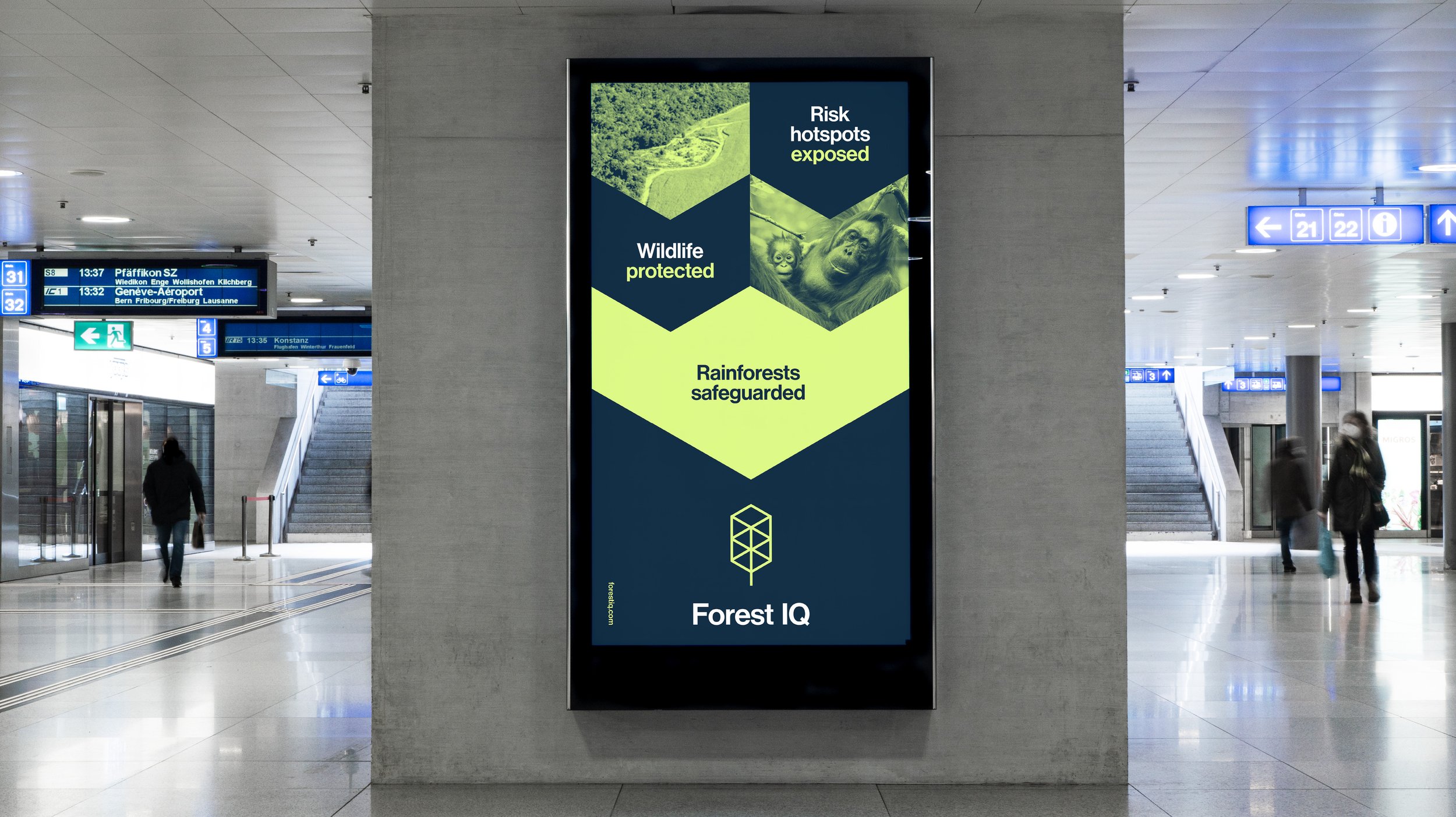
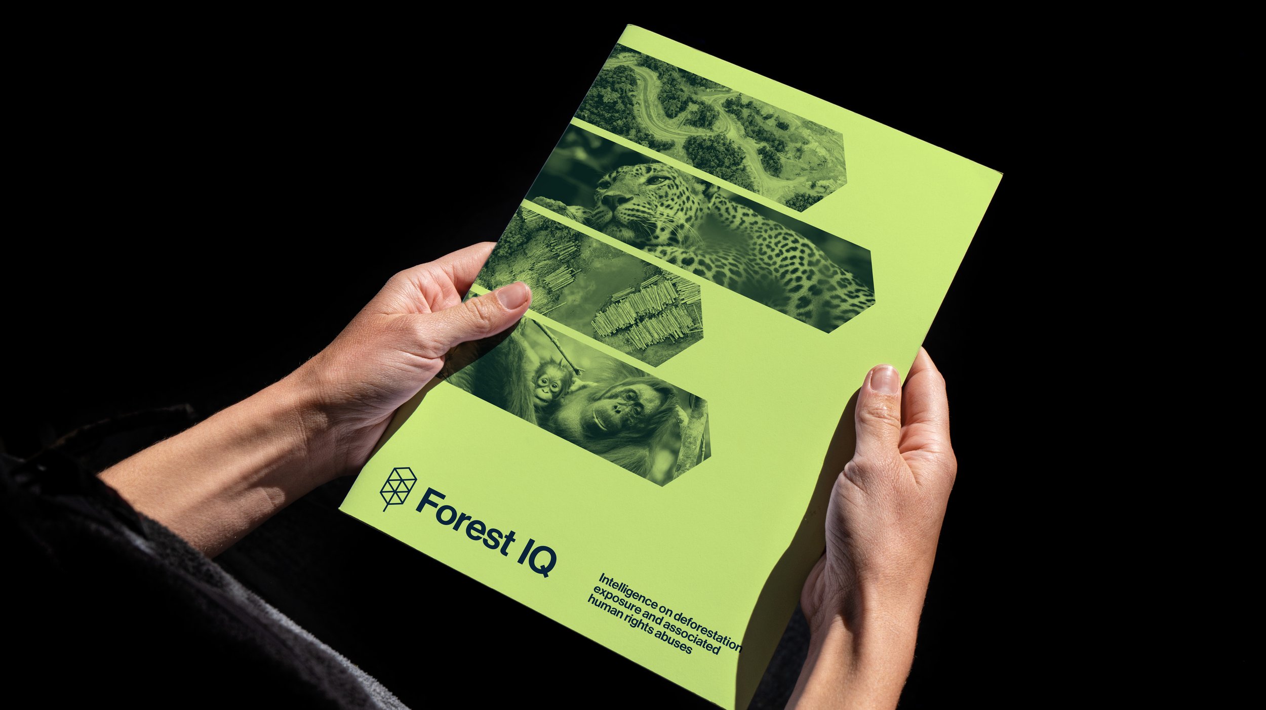
The symbol forms the foundation of a flexible graphic system. It can be used as a framing device for imagery, as well as a structural element to represent supply chains and data flows.
This allows the identity to visually communicate how Forest IQ tracks complex relationships—from rainforest origins through to end-use—across different formats and touchpoints.
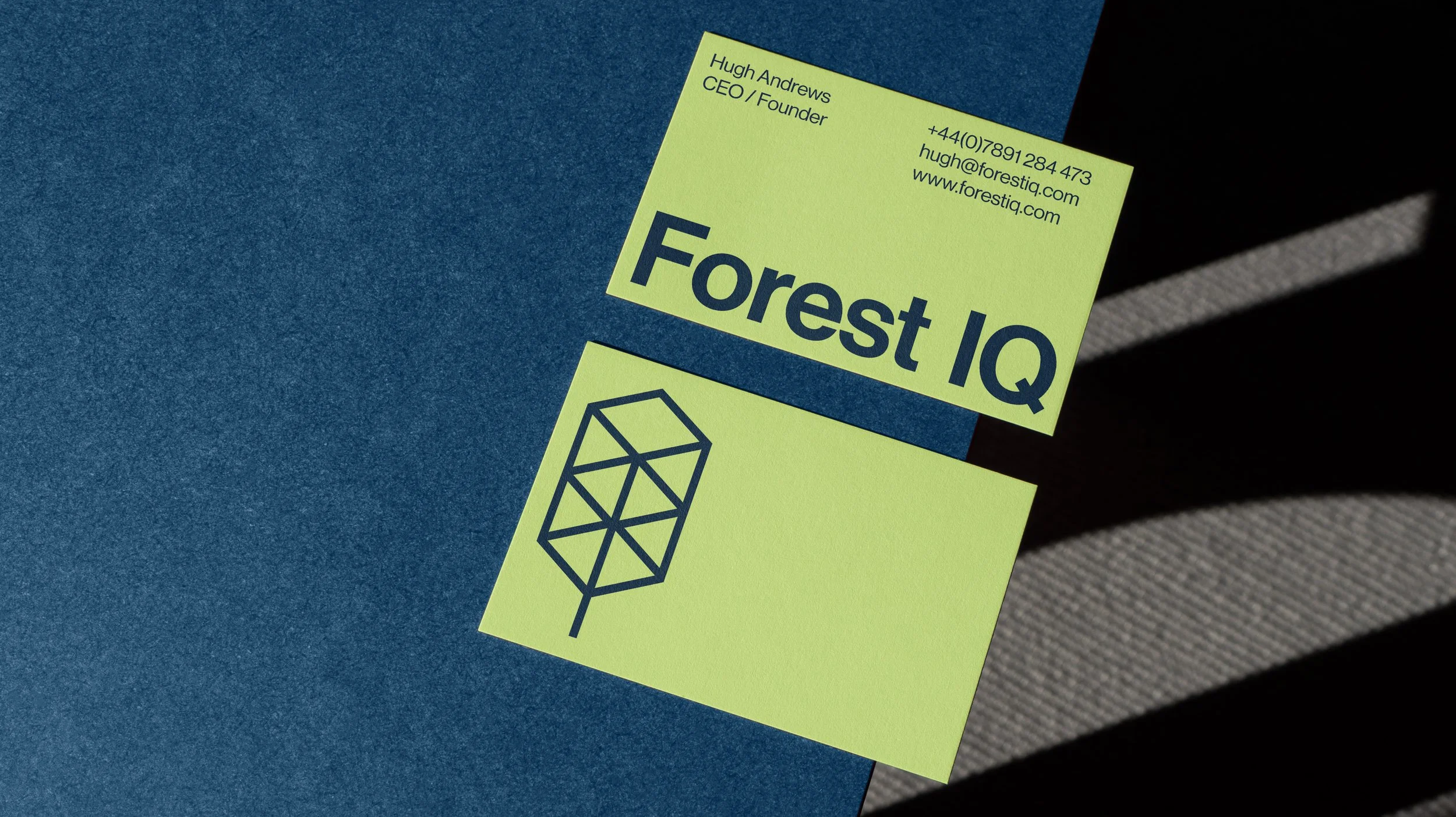
Colour Palette
The colour palette balances urgency with credibility. A vibrant lime-yellow introduces visibility and immediacy, while a deep blue provides a more grounded and professional counterpoint.
This combination supports both engagement and trust, aligning with the platform’s role within the financial sector.
Outcome
The result is a clear and adaptable brand identity for a data-driven sustainability platform, designed to communicate complex information while maintaining a strong and consistent visual presence across digital applications.


FOREST IQ
BRAND IDENTITY
BACKGROUND
—
Forest IQ provides financial institutions with comparable data and metrics across those sectors in their portfolios that may have exposure to deforestation, conversion of natural ecosystems and associated human rights abuses. This enables them to compare companies on their deforestation exposure, materiality and commitments and performance, and make decisions accordingly.
This enables financial institutions to identify risks and opportunities to help them to deliver deforestation-free portfolios.
SOLUTION
—
Our task was to position Forest IQ as something that felt more at home in the technology and finance world rather than the NGO sector. Avoiding earthy colours and cliché environmental charity graphic language was fundamental in this feeling appropriate to where it will exist in a more corporate sector.
The Forest IQ symbol represents data storage whilst also being an abstraction of that which it is at its core, concerned with protecting. Trees.
The visual identity expands on the shape of the symbol and uses it in a range of ways to build a bespoke graphic language, sometimes as simple as a frame for an icon or image and in other instances to graphically depict supply chains through simple vector shapes.
The colour palette is a balance of a vibrant, energetic lime/yellow for immediacy and urgency whilst being grounded in a more sober, professional deep blue.